Monday, November 22, 2010

non-profit website

For the non-profit website assignment I chose to work with the torrance lomita meals on wheels organization.
Their website is tlmow.org

Wednesday, September 29, 2010

Wednesday, September 15, 2010

Assignment #4


For our color assignment I chose the color purple. Purple combines the stability of blue and the energy of red. Purple is associated with royalty. It symbolizes power, nobility, luxury, and ambition. It conveys wealth and extravagance. Purple is associated with wisdom, dignity, independence, creativity, mystery, and magic.


According to surveys, almost 75 percent of pre-adolescent children prefer purple to all other colors. Purple is a very rare color in nature; some people consider it to be artificial.Light purple is a good choice for a feminine design. You can use bright purple when promoting children's products. Dark purple evokes gloom and sad feelings. It can cause frustration.


Purple is royalty. A mysterious color, purple is associated with both nobility and spirituality. The opposites of hot red and cool blue combine to create this intriguing color.
The color of mourning for widows in Thailand, purple was the favorite color of Egypt's Cleopatra. It has been traditionally associated with royalty in many cultures. Purple robes were worn by royalty and people of authority or high rank. The Purple Heart is a U.S. Military decoration given to soldiers wounded in battle.


Pantone has selected the color Blue Iris (PANTONE 18-3943) as the 2008 Color of the Year telling us: "Combining the stable and calming aspects of blue with the mystical and spiritual qualities of purple, Blue Iris satisfies the need for reassurance in a complex world, while adding a hint of mystery and excitement." 


Purple has a special, almost sacred place in nature: lavender, orchid, lilac, and violet flowers are often delicate and considered precious. Because purple is derived from the mixing of a strong warm and strong cool color it has both warm and cool properties. A purple room can boost a child's imagination or an artist's creativity. Too much purple, like blue, could result in moodiness.

Monday, September 13, 2010

assignment #3

For this assignment we had to break up the haiku we had been previously working on and interpret each line differently and separate them into its very own webpage. Then we used only html to design and interpret each line. My reasons for designing the Haiku this way are:

1. I chose to color the background in a way which somehow corresponded to the line. In the first page I chose a "hot" color. At first I went with a red but felt that red was more appropriate for the second page and instead opted for a warm yellow for the first page. I chose green for the third page to represent "blossoming". I felt like green is a color which represents spring time and particularly the blooming of plants and flowers.

2.I also used different fonts to interpret the line of the haiku. I chose futura to display the "wires" because it is thin and angular. I used a serif font and used italics to show its urgency.

3. I also changed the placement of the line on the page to somehow reflect the haiku. I chose a low position on the first page to show that it was "below" some thing. For the second page I showed the line all the way to the right as if to show that it was almost out of the page.

4. For the last slide I chose to space the letters of the line in order to reflect the word "bloom"

5. I chose to also change the font size to correspond the meaning of the line of the haiku. I felt the larger the type was, the more focus and emphasis it brought to that specific line.


Wednesday, September 8, 2010

Assignment #2

For this assignment we had to interpret a haiku using html. Here is what I did

Tuesday, August 31, 2010

Assignment #1

For our first assignment we had to look for 2 websites we thought looked good and two websites we thought didn't.

The Good
RVLT


RVLT is a clothing company based out of Denmark. I really like the layout of the site, especially how it uses the grid but mixes things up a lot. I love the juxtaposition of the images and text, the use of flash, and how the lookbook images are the background of the site itself. The site was designed by hellomonday who make really amazing flash based websites.


SECRET INDICTMENTS


Secret Indictments is the visual blog/image board of graphic designer Jermaine Davis. What i really like about this blog is the simplicity and the use of the grid. In fact, if you press the "g" key on your keyboard, the grid is actually revealed which I think is pretty neat.


The Ugly

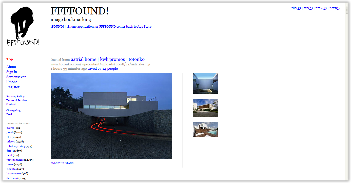
FFFFOUND


FFFFOUND is an image bookmarking site. I like the site itself and the images in it but i just can't get past the bland and uninspired design. For a site that has a lot to do with design it doesn't really have much to offer aesthetically aside from its content. I think a re-design is in order à la dropular.


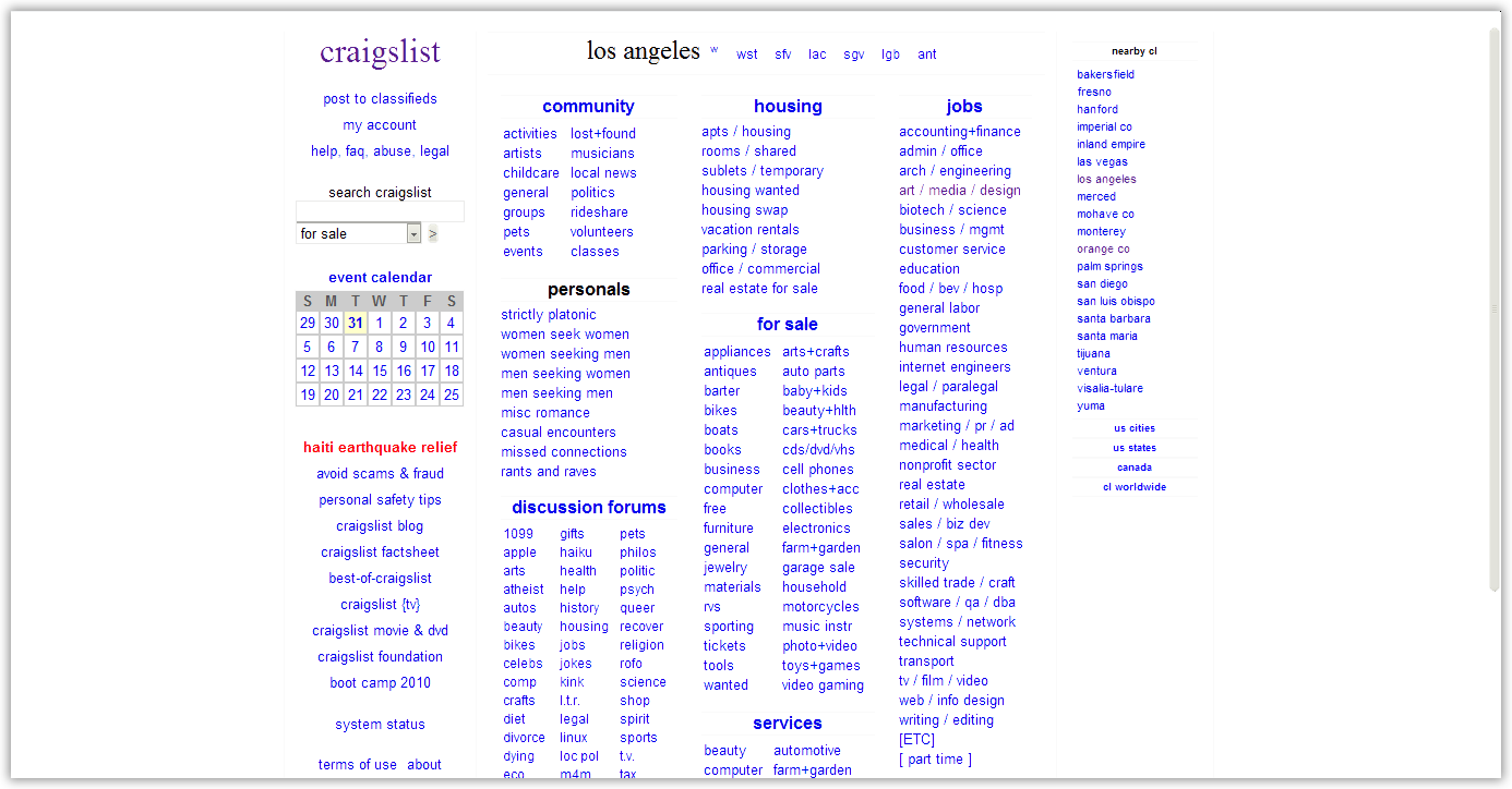
CRAIGSLIST


Craigslist is a great site and a very useful one but it is an eyesore and can look a lot better considering the amount of traffic it receives.

Monday, August 30, 2010

1st post

Hello and welcome to my student blog for professor Willcocks' web design class. Here I will be posting assignments and things generally related to this class.